
Privacy notices, transparency and dark patterns
In this lesson you will:
- List what a privacy notice must tell people
- Design layered and just-in-time notices that people actually read
- Recognise dark patterns in consent and cookie interfaces
- Keep notices accurate as processing changes
Transparency is the principle people experience directly. A privacy notice is often the only part of a privacy programme customers ever see, and regulators treat misleading or unreadable notices as unfair processing in their own right.
1. What a notice must say
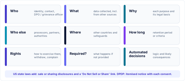
Laws differ in detail, but a good notice answers the same questions:
- Who is processing the data, and how to contact them (and the DPO or grievance officer)
- What personal data is collected, including data obtained from other sources
- Why: each purpose, with its legal basis where the law requires it
- Who else receives it: categories of processors, partners and authorities
- Where: whether data goes to other countries, and the safeguards used
- How long it is kept, or the criteria for deciding
- Rights people have and how to exercise them, including withdrawing consent and complaining to the regulator
- Whether it is required: what happens if the person does not provide it
- Automated decisions or profiling that significantly affect people
US state laws add specific items, such as whether data is "sold" or "shared" for targeted advertising and a "Do Not Sell or Share" link. DPDP requires an itemised notice before or with each consent request, and a way to withdraw consent, exercise rights and complain to the Data Protection Board.
2. Making notices work
A complete notice is useless if nobody reads it. Good practice:
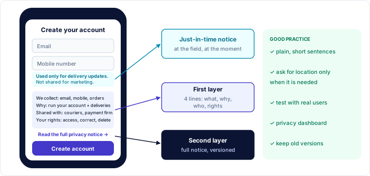
Layer it. A short first layer with the key points (who, main purposes, sharing, rights, link to more), and a full second layer for those who want detail.
Put it in context. Use just-in-time notices at the moment data is collected: a line under a phone-number field saying "We use this only to send delivery updates". Ask for permissions such as location or camera when the feature needs them, not at installation.
Write plainly. Short sentences, active voice, everyday words, and no "may include but is not limited to". Test the text with real users, including children if the service is likely to be used by them.
Use icons and dashboards. Privacy dashboards let people see and change their settings in one place.
🔐 Privacy lens
A notice is a promise. If engineering adds a new data flow, a new vendor or a new purpose without updating the notice, the organisation is now processing unfairly. Tie notice reviews to your change-management process.
3. Dark patterns
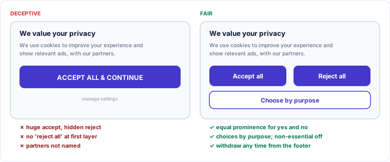
Dark patterns (also called deceptive design) are interface designs that push people into choices they would not otherwise make. Regulators in the EU, US and India have all acted against them; India issued guidelines on dark patterns for consumer protection in 2023, and US state laws say consent obtained through dark patterns is not valid consent.
Common examples:
| Pattern | What it looks like | Why it fails |
|---|---|---|
| Asymmetric choice | Big bright "Accept all", tiny grey "Settings" link | Rejecting must be as easy as accepting |
| Pre-ticked boxes | Optional purposes already switched on | Consent needs an affirmative act |
| Confirmshaming | "No thanks, I don't care about my health" | Guilt is pressure, not choice |
| Nagging | Asking again on every visit after a "no" | Wears people down |
| Obstruction | Easy sign-up, but cancelling needs a phone call | Withdrawal must be as easy as giving consent |
| Bundling | One tick for terms, marketing and data sharing | Consent must be specific |
| Hidden information | Key facts buried in long text or after many clicks | Consent is not informed |
4. Keeping notices accurate
Notices drift out of date as products change. Keep them accurate by:
- linking every entry in the record of processing to a notice section
- adding a "notice impact" question to product and vendor change requests
- versioning notices and keeping old versions, so you can show what people were told when they consented
- reviewing them at least annually, and telling people about material changes before they take effect
Worked example — fixing a sign-up flow
An e-learning app's sign-up screen has a single checkbox: "I agree to the Terms, Privacy Policy and to receive offers from partners", already ticked.
| Problem | Fix |
|---|---|
| Pre-ticked box | Leave unticked; require an action |
| Terms, privacy and marketing bundled | Separate: accept terms (required), read privacy notice (link, no tick needed), optional marketing opt-in |
| Partner sharing hidden in one line | Separate optional choice naming partner categories |
| No first-layer summary | Three-line summary above the button: what we collect, why, your rights |
| Location requested at install | Ask only when the learner opens "find a study group near me" |
| Unsubscribing requires email to support | One-click unsubscribe in every email and a settings toggle |
Key takeaways
- Notices must cover who, what, why, who else, where, how long, rights, whether data is required, and automated decisions.
- Layered and just-in-time notices in plain language make transparency real.
- Dark patterns invalidate consent and draw regulatory action; equal prominence and easy withdrawal are core tests.
- Notices are living documents: tie them to the record of processing and to change management.
Self-check
- What belongs in the first layer of a layered notice?
- Give three examples of dark patterns.
- Why should you keep old versions of a privacy notice?